Introducing responsive web design
HTML is fundamentally responsive, or fluid. If you create a web page containing only HTML, with no CSS, and resize the window, the browser will automatically reflow the text to fit the viewport.
While the default responsive behavior may sound like no solution is needed, long lines of text displayed full screen on a wide monitor can be difficult to read. If wide screen line length is reduced with CSS, such as by creating columns or adding significant padding, the site may look squashed for the user who narrows their browser window or opens the site on a mobile device.
Responsive web design, or RWD, is a design approach that addresses the range of devices and device sizes, enabling automatic adaption to the screen, whether the content is viewed on a tablet, phone, television, or watch.
Media Queries
Media queries allow us to run a series of tests (for example, whether the user's screen is greater than a certain width or resolution) and apply CSS selectively to style the page appropriately for the user's needs.
For example, the following media query tests to see if the current web page is being displayed as screen media (therefore not a printed document) and the viewport is at least 80rem wide. The CSS for the .container selector will only be applied if these two things are true.
@media screen and (min-width: 80rem) {
  .container {
    margin: 1em 2em;
  }
}
You can add multiple media queries within a stylesheet, tweaking your whole layout or parts of it to best suit the various screen sizes. The points at which a media query is introduced, and the layout changed, are known as breakpoints.
A common approach when using media queries is to create a simple single-column layout for narrow-screen devices (for example, mobile phones), then check for wider screens and implement a multiple-column layout when you know that you have enough screen width to handle it. Designing for mobile first is known as mobile first design.
Responsive layout technologies
Responsive sites are built on flexible grids, meaning you don't need to target every possible device size with pixel perfect layouts.
By using a flexible grid, you can change a feature or add in a breakpoint and change the design at the point where the content starts to look bad. For example, to ensure line lengths don't become unreadably long as the screen size increases you can use columns; if a box becomes squashed with two words on each line as it narrows you can set a breakpoint.
Several layout methods — including Flexbox, and CSS Grid — are responsive by default. They all assume that you are trying to create a flexible grid and give you easier ways to do so.
Flexbox
In flexbox, flex items shrink or grow, distributing space between the items according to the space in their container. By changing the values for flex-grow and flex-shrink you can indicate how you want the items to behave when they encounter more or less space around them.
In the example below the flex items will each take an equal amount of space in the flex container, using the shorthand of flex: 1
.container {
  display: flex;
}

.item {
  flex: 1;
}
Here's how we could use flexbox with a media query for responsive design.
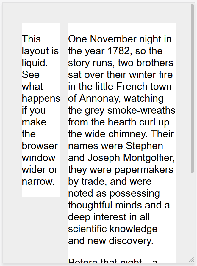
<div class="wrapper">
  <div class="col1">
    <p>
      This layout is responsive. See what happens if you make the browser window
      wider or narrow.
    </p>
  </div>
  <div class="col2">
    <p>
      One November night in the year 1782, so the story runs, two brothers sat
      over their winter fire in the little French town of Annonay, watching the
      grey smoke-wreaths from the hearth curl up the wide chimney. Their names
      were Stephen and Joseph Montgolfier, they were papermakers by trade, and
      were noted as possessing thoughtful minds and a deep interest in all
      scientific knowledge and new discovery.
    </p>
    <p>
      Before that night—a memorable night, as it was to prove—hundreds of
      millions of people had watched the rising smoke-wreaths of their fires
      without drawing any special inspiration from the fact.
    </p>
  </div>
</div>
@media screen and (min-width: 600px) {
.wrapper {
display: flex;
}
.col1 {
flex: 1;
margin-right: 5%;
}
.col2 {
flex: 2;
}
}CSS Grid
In CSS grid layout the fr unit allows the distribution of available space across grid tracks. The next example creates a grid container with three tracks sized at 1fr. This will create three column tracks, each taking one part of the available space in the container
.container {
  display: grid;
  grid-template-columns: 1fr 1fr 1fr;
}
Here's how we could use grid layout with a media query for responsive design.
<div class="wrapper">
  <div class="col1">
    <p>
      This layout is responsive. See what happens if you make the browser window
      wider or narrow.
    </p>
  </div>
  <div class="col2">
    <p>
      One November night in the year 1782, so the story runs, two brothers sat
      over their winter fire in the little French town of Annonay, watching the
      grey smoke-wreaths from the hearth curl up the wide chimney. Their names
      were Stephen and Joseph Montgolfier, they were papermakers by trade, and
      were noted as possessing thoughtful minds and a deep interest in all
      scientific knowledge and new discovery.
    </p>
    <p>
      Before that night—a memorable night, as it was to prove—hundreds of
      millions of people had watched the rising smoke-wreaths of their fires
      without drawing any special inspiration from the fact.
    </p>
  </div>
</div>
@media screen and (min-width: 600px) {
.wrapper {
display: grid;
grid-template-columns: 1fr 2fr;
column-gap: 5%;
}
}Responsive images/media
To ensure media is never larger than its responsive container, the following approach can be used:
img,
picture,
video {
  max-width: 100%;
}
This scales media to ensure they never overflow their containers.
The viewport meta tag
If you look at the HTML source of a responsive page, you will usually see the following <meta> tag in the <head> of the document.
<meta name="viewport" content="width=device-width,initial-scale=1" />This viewport meta tag tells mobile browsers that they should set the width of the viewport to the device width, and scale the document to 100% of its intended size, which shows the document at the mobile-optimized size that you intended.