CSS Grid Layout
CSS grid layout is a two-dimensional layout system for the web. It lets you organize content into rows and columns and offers many features to simplify the creation of complex layouts.
What is grid layout?
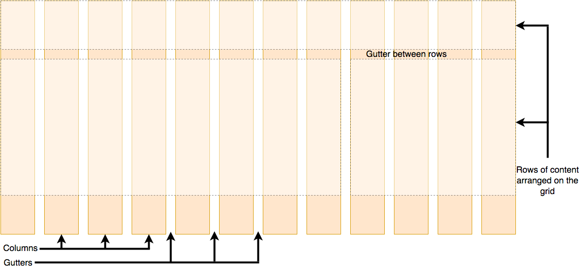
A grid is a collection of horizontal and vertical lines creating a pattern against which we can line up our design elements. They help us to create layouts in which our elements won't jump around or change width as we move from page to page, providing greater consistency on our websites.
A grid will typically have columns, rows, and then gaps between each row and column. The gaps are commonly referred to as gutters.
Defining a grid
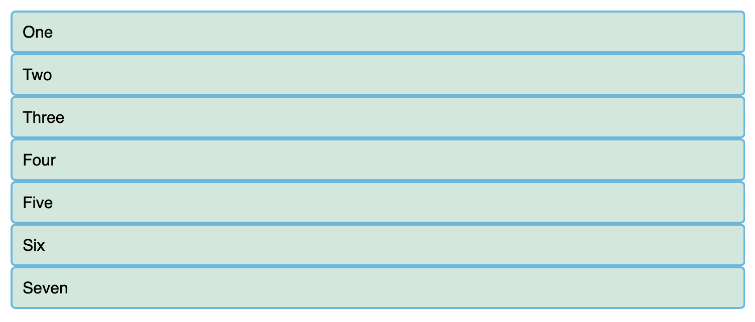
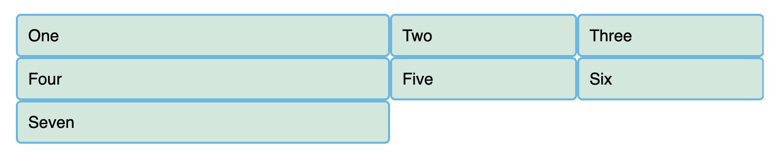
Let's try out grid layouts, here is an example with a container, which has some child items. By default, these items are displayed in a normal flow, causing them to appear one below the other.
<div class="container">
  <div>One</div>
  <div>Two</div>
  <div>Three</div>
  <div>Four</div>
  <div>Five</div>
  <div>Six</div>
  <div>Seven</div>
</div>
body {
font-family: sans-serif;
}
.container > div {
border-radius: 5px;
padding: 10px;
background-color: rgb(207 232 220);
border: 2px solid rgb(79 185 227);
}Similar to how you define flexbox, you define a grid layout by setting the value of the display property to grid. As in the case of flexbox, the display: grid property transforms all the direct children of the container into grid items. We have added the following CSS to the file:
.container {
  display: grid;
}
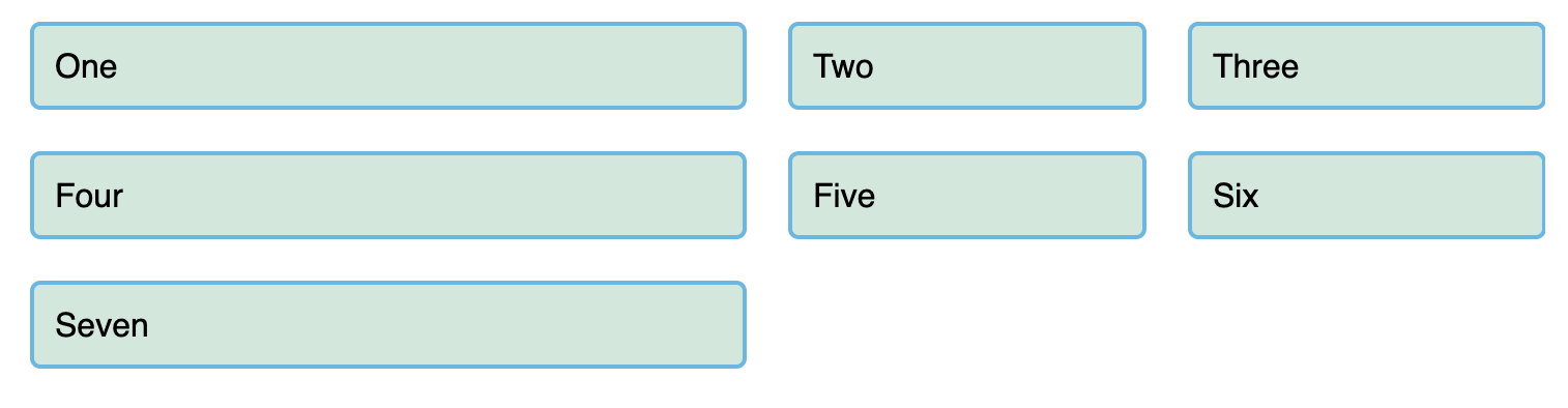
Unlike flexbox, the items will not immediately look any different. Declaring display: grid gives you a one column grid, so your items will continue to display one below the other as they do in normal flow.
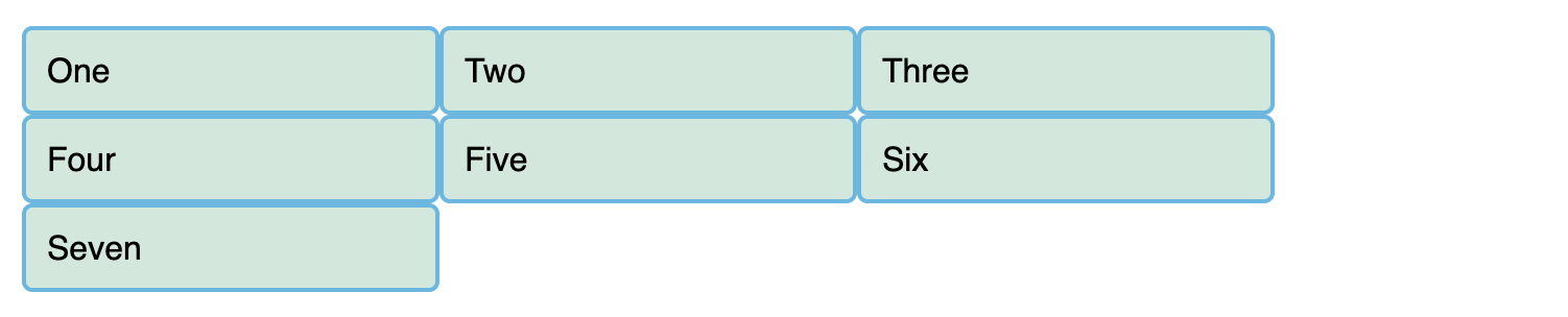
To see something that looks more grid-like, we'll need to add some columns to the grid. Let's add three 200-pixel columns. You can use any length unit or percentage to create these column tracks.
.container {
  display: grid;
  grid-template-columns: 200px 200px 200px;
}
You should see that the items have rearranged themselves such that there's one in each cell of the grid.
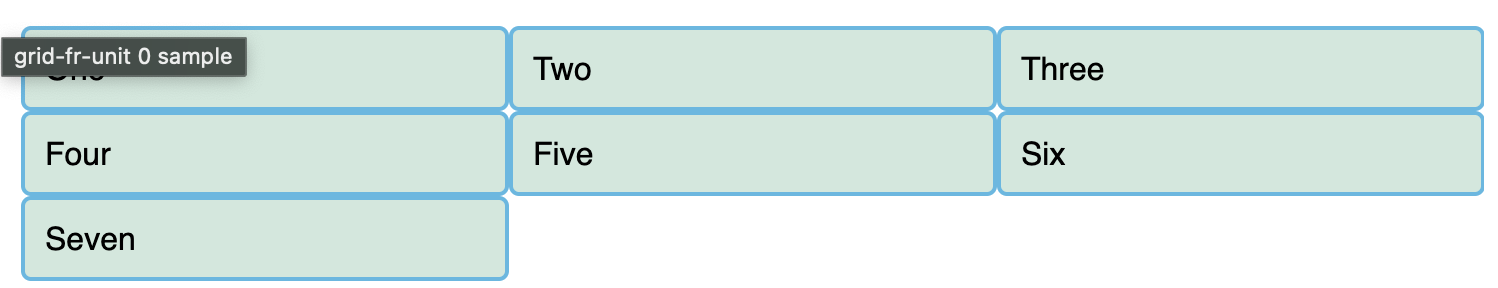
Flexible grids with the fr unit
In addition to creating grids using lengths and percentages, we can use fr. The fr unit represents one fraction of the available space in the grid container to flexibly size grid rows and columns.
Here we change the track listing to the following definition, creating three 1fr tracks:
.container {
  display: grid;
  grid-template-columns: 1fr 1fr 1fr;
}
You now have flexible tracks. The fr unit distributes space proportionally, so you can specify different positive values for your tracks. Change your track listing to the following definition, creating one 2fr track and two 1fr tracks:
.container {
  display: grid;
  grid-template-columns: 2fr 1fr 1fr;
}
The first track gets 2fr of the available space and the other two tracks get 1fr, making the first track larger. You can mix fr units with fixed length units. In this case, the space needed for the fixed tracks is used up first before the remaining space is distributed to the other tracks.
Note: The fr unit distributes available space, not all space. Therefore, if one of your tracks has something large inside it, there will be less free space to share.
Gaps between tracks
To create gaps between tracks, we use the properties:
column-gapfor gaps between columnsrow-gapfor gaps between rowsgapas a shorthand for both Here we add the gap property to create gaps between the tracks with a value of 20px:
.container {
  display: grid;
  grid-template-columns: 2fr 1fr 1fr;
  gap: 20px;
}
Line-based placement
We now move on from creating a grid to placing things on the grid. Our grid always has lines — these are numbered beginning with 1 and relate to the writing mode of the document. For example, column line 1 in English (written left-to-right) would be on the left-hand side of the grid and row line 1 at the top, while in Arabic (written right-to-left), column line 1 would be on the right-hand side.
To position items along these lines, we can specify the start and end lines of the grid area where an item should be placed. There are four properties we can use to do this:
grid-column-startgrid-column-endgrid-row-startgrid-row-end
These properties accept line numbers as their values, so we can specify that an item should start on line 1 and end on line 3, for example. Alternatively, you can also use shorthand properties that let you specify the start and end lines simultaneously, separated by a forward slash /:
grid-columnshorthand for grid-column-start and grid-column-endgrid-rowshorthand for grid-row-start and grid-row-end
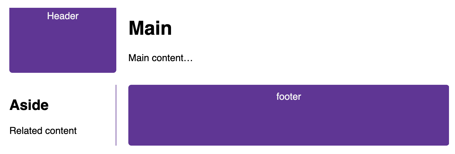
<div class="container">
  <header>Header</header>
  <main>
    <h1>Main</h1>
    <p>Main content…</p>
  </main>
  <aside>
    <h2>Aside</h2>
    <p>Related content</p>
  </aside>
  <footer>footer</footer>
</div>
.container {
font-family: sans-serif;
display: grid;
grid-template-columns: 1fr 3fr;
gap: 20px;
}
header,
footer {
border-radius: 5px;
padding: 10px;
background-color: rebeccapurple;
color: whitesmoke;
text-align: center;
}
aside {
border-right: 1px solid rebeccapurple;
}With out the placement defined, you can see that auto-placement is placing each item into its own cell in the grid. The <header> is taking up 1fr (one quarter) and the <main> is taking up 3fr (three quarters).
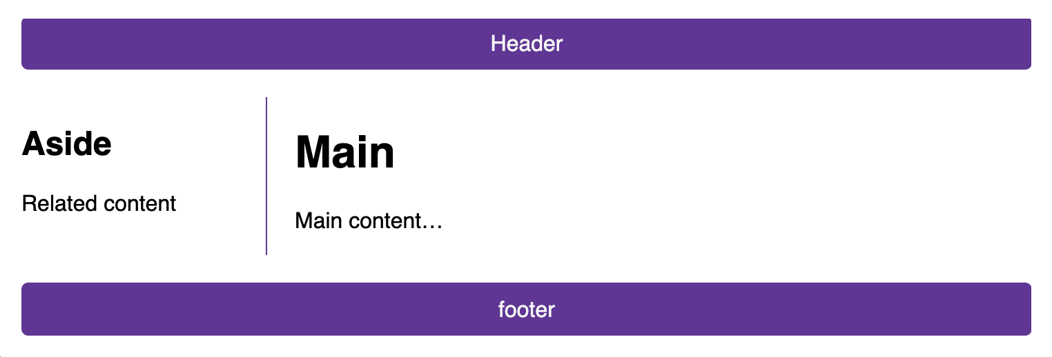
Let's arrange all of the elements for our site by using the grid lines. Add the following rules to the bottom of your CSS:
header {
  grid-column: 1 / 3;
  grid-row: 1;
}
main {
  grid-column: 2;
  grid-row: 2;
}
aside {
  grid-column: 1;
  grid-row: 2;
}
footer {
  grid-column: 1 / 3;
  grid-row: 3;
}
Now the <header> and <footer> are set to 1 / 3, which means to start at line 1 and ends at line 3.
Positioning with grid-template-areas
An alternative way to arrange items on your grid is to use the grid-template-areas property and give the various elements of your design a name.
.container {
  display: grid;
  grid-template-areas:
    "header header"
    "sidebar content"
    "footer footer";
  grid-template-columns: 1fr 3fr;
  gap: 20px;
}
header {
  grid-area: header;
}
main {
  grid-area: content;
}
aside {
  grid-area: sidebar;
}
footer {
  grid-area: footer;
}
Here we are using the grid-template-areas property to define how the 3 rows are laid out. The first row has a value of header header, the second sidebar content and the third footer footer. We are then using the grid-area property to define where elements are placed in the grid-template-areas.
The rules for grid-template-areas are as follows:
- You need to have every cell of the grid filled.
- To span across two cells, repeat the name.
- To leave a cell empty, use a
.(period). - Areas must be rectangular — for example, you can't have an L-shaped area.
- Areas can't be repeated in different locations.
You can play around with our layout, changing the footer to only sit underneath the article and the sidebar to span all the way down. This is a very nice way to describe a layout because it's clear just from looking at the CSS to know exactly what's happening.