Flexbox
Flexbox is a one-dimensional layout method for arranging items in rows or columns. Items flex (expand) to fill additional space or shrink to fit into smaller spaces.
Why flexbox?
CSS flexible box layout enables you to:
- Vertically center a block of content inside its parent.
- Make all the children of a container take up an equal amount of the available width/height, regardless of how much width/height is available.
- Make all columns in a multiple-column layout adopt the same height even if they contain a different amount of content.
Flexbox features may be the perfect solution for your one dimensional layout needs. Let's dig in and find out!
A simple example
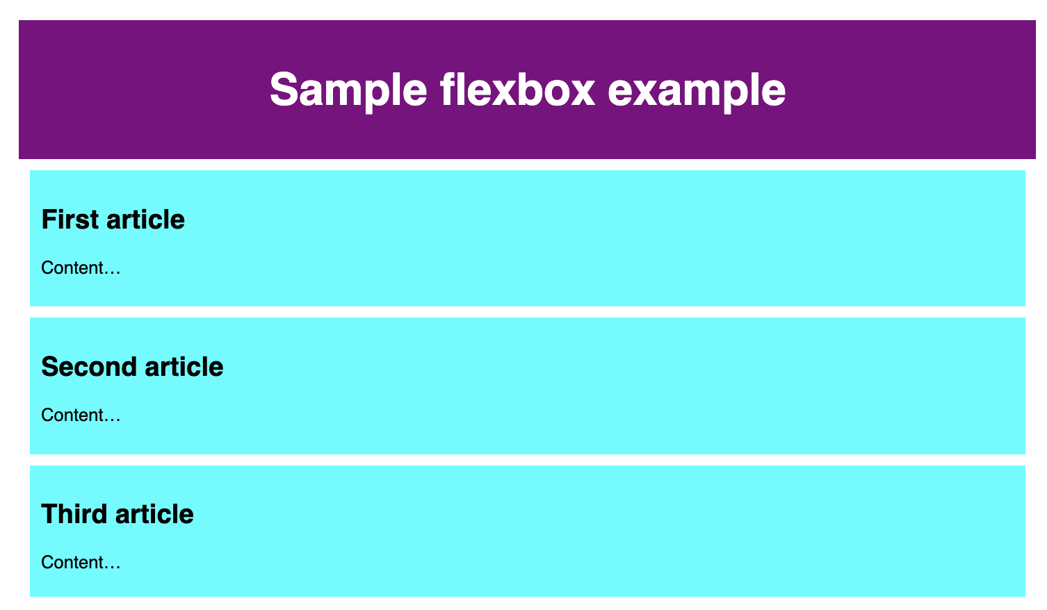
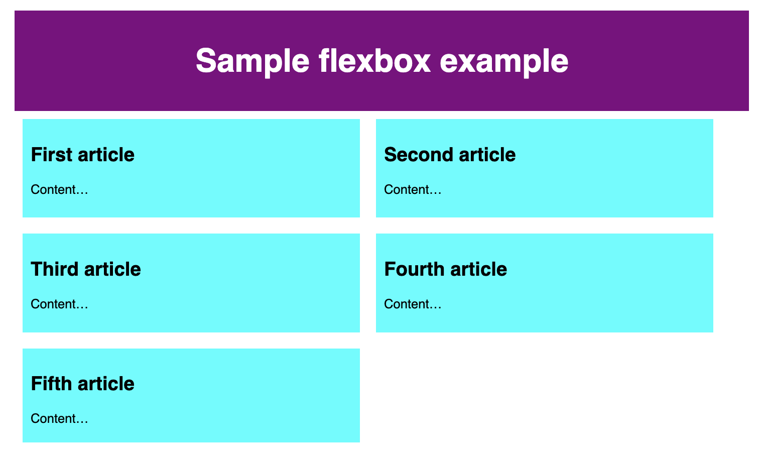
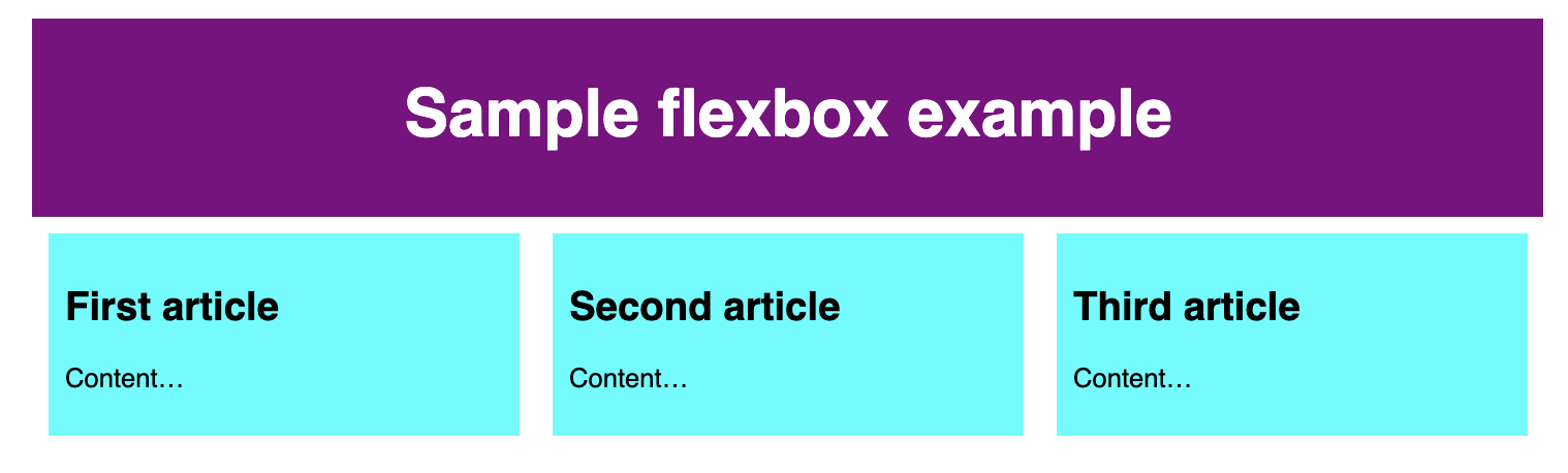
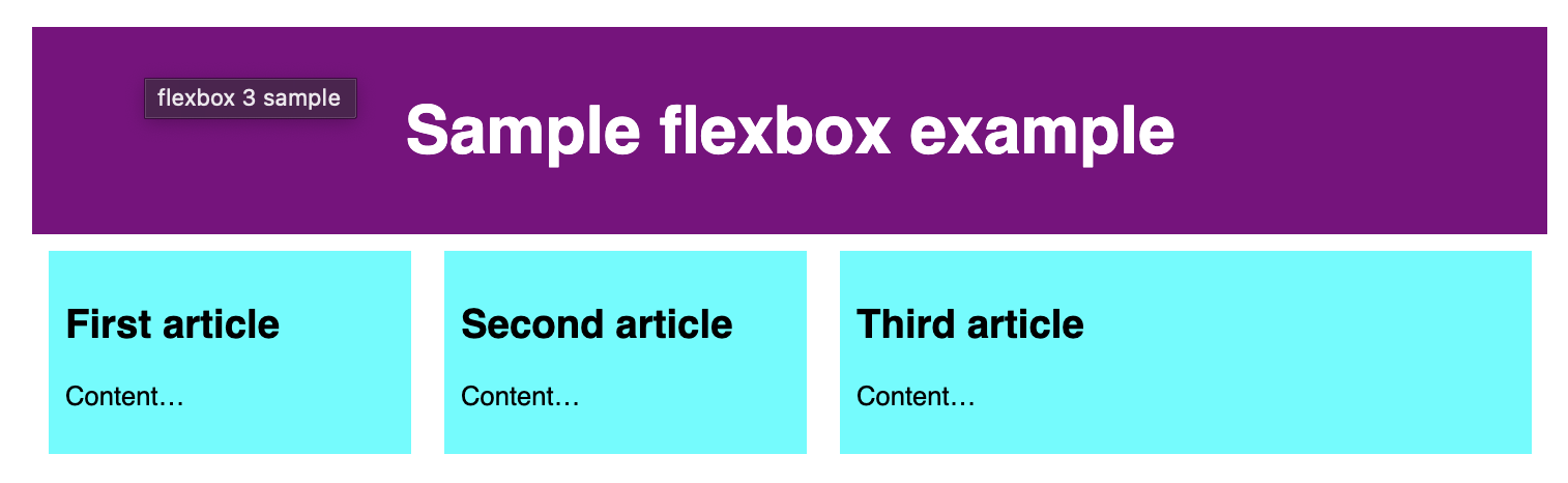
<header>
  <h1>Sample flexbox example</h1>
</header>
<section>
  <article>
    <h2>First article</h2>
    <p>Content…</p>
  </article>
  <article>
    <h2>Second article</h2>
    <p>Content…</p>
  </article>
  <article>
    <h2>Third article</h2>
    <p>Content…</p>
  </article>
</section>
body {
font-family: sans-serif;
margin: 0;
}
header {
background: purple;
height: 100px;
}
h1 {
text-align: center;
color: white;
line-height: 100px;
margin: 0;
}
section {
zoom: 0.8;
}
article {
padding: 10px;
margin: 10px;
background: aqua;
}
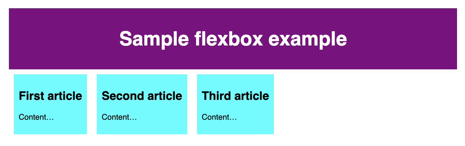
To start with, we need to select which elements are to be laid out as flexible boxes. To do this, we set a special value of display on the parent element of the elements you want to affect. In this case we want to lay out the <article> elements, so we set this on the <section>:
section {
  display: flex;
}
This causes the <section> element to become a flex container and its children become flex items. This is what it looks like:
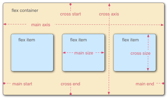
The flex model
When elements are laid out as flex items, they are laid out along two axes:
Columns or rows?
Flexbox provides a property called flex-direction that specifies which direction the main axis runs (which direction the flexbox children are laid out in). By default this is set to row, which causes them to be laid out in a row in the direction your browser's default language works in (left to right, in the case of an English browser).
Try adding the following declaration to your <section> rule:
flex-direction: column;You'll see that this puts the items back in a column layout, much like they were before we added any CSS
Wrapping
One issue that arises when you have a fixed width or height in your layout is that eventually your flexbox children will overflow their container, breaking the layout. In the following example we have 5 <article>s, which don't fit, because they have a min-width of 400px, so there is a horizontal scroll.
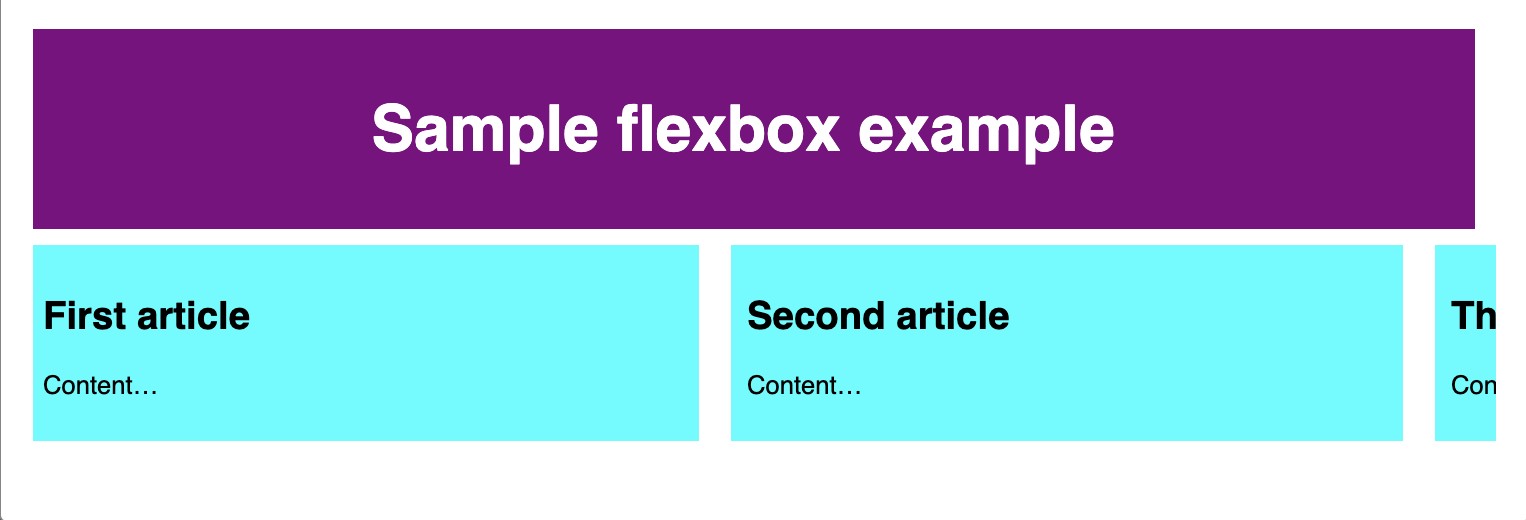
Here we see that the children are indeed breaking out of their container. By default, the browser tries to place all the flex items in a single row if the flex-direction is set to row or a single column if the flex-direction is set to column.
One way in which you can fix this is to add the following declaration to your <section> rule:
section {
  flex-wrap: wrap;
}
You'll see that the layout looks much better with this included:
Flexible sizing of flex items
Let's now return to our first example and look at how we can control what proportion of space flex items take up compared to the other flex items.
In your local copy, add the following rule to the bottom of your CSS:
article {
  flex: 1;
}
This is a unitless proportion value that dictates how much available space along the main axis each flex item will take up compared to other flex items. In this case, we're giving each <article> element the same value (a value of 1), which means they'll all take up an equal amount of the spare space left after properties like padding and margin have been set. This value is proportionally shared among the flex items: giving each flex item a value of 400000 would have exactly the same effect.
Now add the following rule below the previous one:
article:nth-of-type(3) {
  flex: 2;
}
Now when you refresh, you'll see that the third <article> takes up twice as much of the available width as the other two. There are now four proportion units available in total (since 1 + 1 + 2 = 4). The first two flex items have one unit each, so they each take 1/4 of the available space. The third one has two units, so it takes up 2/4 of the available space (or one-half).
You can also specify a minimum size value within the flex value. Try updating your existing article rules like so:
article {
  flex: 1 100px;
}

article:nth-of-type(3) {
  flex: 2 100px;
}
This basically states, "Each flex item will first be given 100px of the available space. After that, the rest of the available space will be shared according to the proportion units." You'll see a difference in how the space is shared.
All the flex items have a minimum width of 100 pixels—set using 'flex'. The value of flex for first two flex items is 1 and for the third item is 2. This splits the remaining space in the flex container into 4 proportion units. One unit is assigned to each of the first two flex items and 2 units are assigned to the third flex item, making the third flex item wider than the other two, which are of the same width.
flex: shorthand versus longhand
flex is a shorthand property that can specify up to three different values:
- The unitless proportion value we discussed above. This can be specified separately using the flex-grow longhand property.
- A second unitless proportion value, flex-shrink, which comes into play when the flex items are overflowing their container. This value specifies how much an item will shrink in order to prevent overflow. This is quite an advanced flexbox feature and we won't be covering it any further in this article.
- The minimum size value we discussed above. This can be specified separately using the flex-basis longhand value.
Horizontal and vertical alignment
The align-items property controls where the flex items sit on the cross axis.
- By default, the value
normalwhich behaves asstretchin flexbox. This stretches all flex items to fill the parent in the direction of the cross axis. If the parent doesn't have a fixed size in the cross axis direction, then all flex items will become as tall (or wide) as the tallest (or widest) flex item. This is how our first example had columns of equal height by default. - The
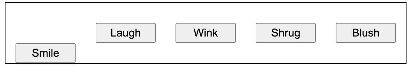
centervalue that we used in our above code causes the items to maintain their intrinsic dimensions, but be centered along the cross axis. This is why our current example's buttons are centered vertically. - You can also have values like
flex-start,self-startorstartandflex-end,self-endorend, which will align all items at the start and end of the cross axis respectively. The baseline values will line up the flex items by their baseline; basically the bottom of each flex items first line of text will be lined up with the bottom of the first line of the element with the greatest distance between the cross start and that baseline. See align-items for the full details.
div {
  display: flex;
  align-items: center;
  justify-content: space-around;
}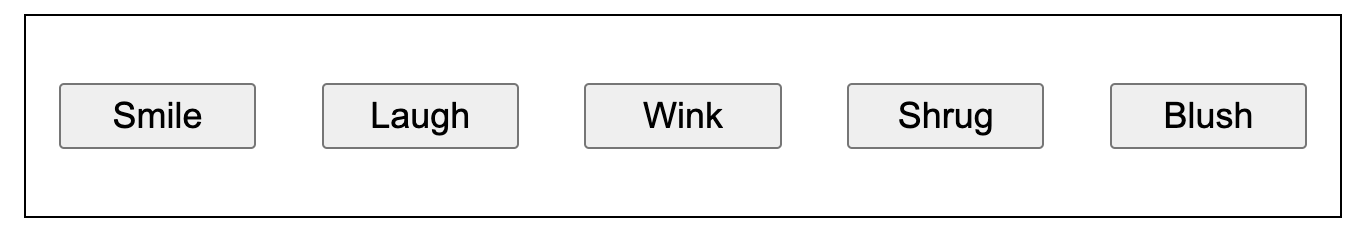
You can override the align-items behavior for individual flex items by applying the align-self property to them. For example, try adding the following to your CSS:
button:first-child {
  align-self: flex-end;
}
justify-content controls where the flex items sit on the main axis.
- The default value is
normal, which behaves asstart, which makes all the items sit at the start of the main axis. - You can use
endorflex-endto make them sit at the end. - The
leftandrightvalues behave asstartorenddepending on the writing mode direction. centeris also a value forjustify-content. It'll make the flex items sit in the center of the main axis.- The value we've used above,
space-around, is useful — it distributes all the items evenly along the main axis with a bit of space left at either end. - There is another value,
space-between, which is very similarto space-aroundexcept that it doesn't leave any space at either end.